Randomization and matching

R stuff
Download all the R stuff we did today if you want to try it on your own computer: week-7.zip
Load data for examples
Download these two CSV files and put them in a folder named data in a new RStudio project:
library(tidyverse)  # ggplot(), %>%, mutate(), and friends
library(ggdag)  # Make DAGs
library(scales)  # Format numbers with functions like comma(), percent(), and dollar()
library(broom)  # Convert models to data frames
library(patchwork)  # Combine ggplots into single composite plots
library(MatchIt)  # Match things

set.seed(1234)   # Make all random draws repdroducible
village_randomized <- read_csv("data/village_randomized.csv")
math_camp <- read_csv("data/math_camp.csv") %>%
# This makes it so "No math camp" is the reference category
mutate(math_camp = fct_relevel(math_camp, "No math camp"))Randomized controlled trials
Program details
In this hypothetical situation, an NGO is planning on launching a training program designed to boost incomes. Based on their experiences in running pilot programs in other countries, they’ve found that older, richer men tend to self-select into the training program. The NGO’s evaluation consultant (you!) drew this causal model explaining the effect of the program on participant incomes, given the confounding caused by age, sex, and prior income:
income_dag <- dagify(post_income ~ program + age + sex + pre_income,
                     program ~ age + sex + pre_income,
                     exposure = "program",
                     outcome = "post_income",
                     labels = c(post_income = "Post income",
                                program = "Program",
                                age = "Age",
                                sex = "Sex",
                                pre_income = "Pre income"),
                     coords = list(x = c(program = 1, post_income = 5, age = 2,
                                         sex = 4, pre_income = 3),
                                   y = c(program = 2, post_income = 2, age = 1,
                                         sex = 1, pre_income = 3)))

ggdag_status(income_dag, use_labels = "label", text = FALSE, seed = 1234) +
  guides(color = FALSE) +
  theme_dag()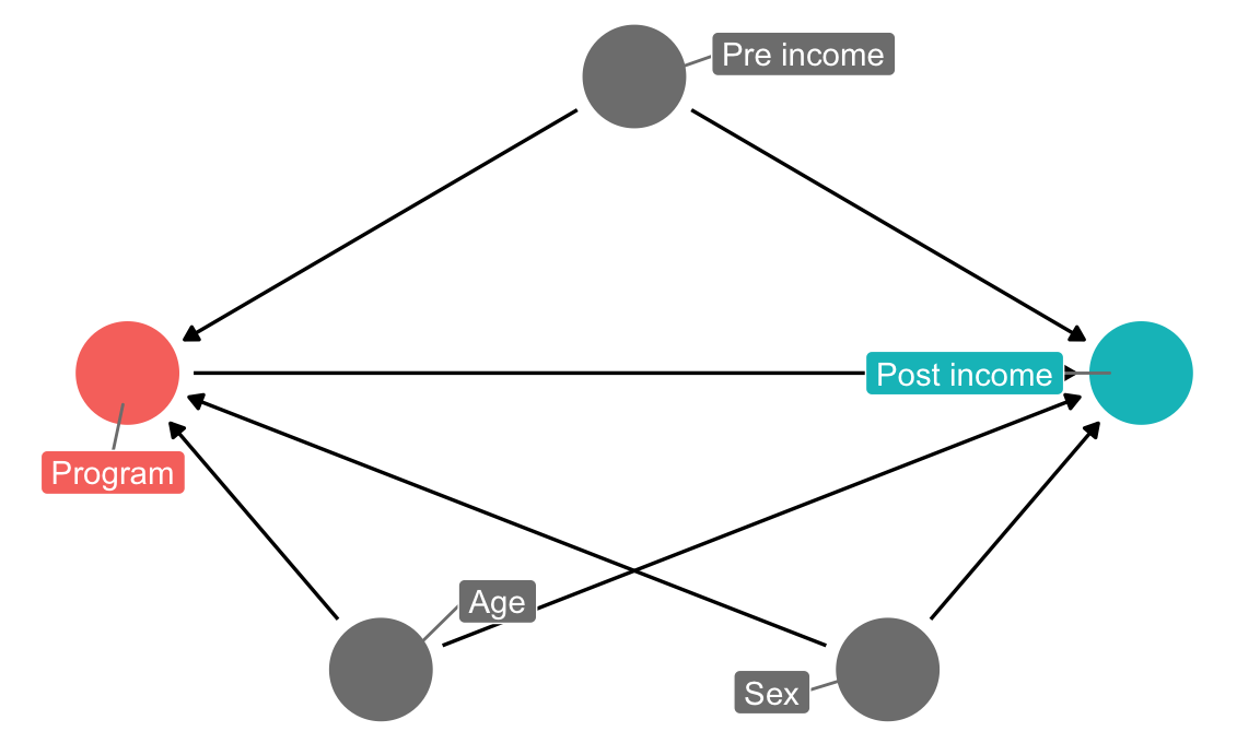
The NGO just received funding to run a randomized controlled trial (RCT) in a village, and you’re excited because you can finally manipulate access to the program—you can calculate \(E(\text{Post-income} | do(\text{Program})\). Following the rules of causal diagrams, you get to delete all the arrows going into the program node:
income_dag_rct <- dagify(post_income ~ program + age + sex + pre_income,
                         exposure = "program",
                         outcome = "post_income",
                         labels = c(post_income = "Post income",
                                    program = "Program",
                                    age = "Age",
                                    sex = "Sex",
                                    pre_income = "Pre income"),
                         coords = list(x = c(program = 1, post_income = 5, age = 2,
                                             sex = 4, pre_income = 3),
                                       y = c(program = 2, post_income = 2, age = 1,
                                             sex = 1, pre_income = 3)))

ggdag_status(income_dag_rct, use_labels = "label", text = FALSE, seed = 1234) +
  guides(color = FALSE) +
  theme_dag()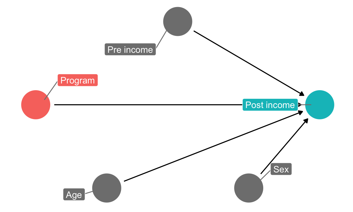
1. Check balance
You ran the study on 1,000 participants over the course of 6 months and you just got your data back.
Before calculating the effect of the program, you first check to see how well balanced assignment was, and you find that assignment to the program was pretty much split 50/50, which is good:
village_randomized %>%
  count(program) %>%
  mutate(prop = n / sum(n))
## # A tibble: 2 x 3
## program n prop
## <chr> <int> <dbl>
## 1 No program 503 0.503
## 2 Program 497 0.497You then check to see how well balanced the treatment and control groups were in participants’ pre-treatment characteristics:
village_randomized %>%
  group_by(program) %>%
  summarize(prop_male = mean(sex_num),
            avg_age = mean(age),
            avg_pre_income = mean(pre_income))
## # A tibble: 2 x 4
## program prop_male avg_age avg_pre_income
## <chr> <dbl> <dbl> <dbl>
## 1 No program 0.584 34.9 803.
## 2 Program 0.604 34.9 801.These variables appear fairly well balanced. To check that there aren’t any statistically significant differences between the groups, you make some graphs (you could run t-tests too, but graphs are easier for your non-statistical audience to read later).
There were more men in both the treatment and control groups, but the proportion is the same in both, and there’s no substantial difference in sex proportion:
# Here we save each plot as an object so that we can combine the two plots with
# + (which comes from the patchwork package). If you want to see what an
# individual plot looks like, you can run `plot_diff_sex`, or whatever the plot
# object is named.
#
# stat_summary() here is a little different from the geom_*() layers you've seen
# in the past. stat_summary() takes a function (here mean_se()) and runs it on
# each of the program groups to get the average and standard error. It then
# plots those with geom_pointrange. The fun.args part of this lets us pass an
# argument to mean_se() so that we can multiply the standard error by 1.96,
# giving us the 95% confidence interval.
plot_diff_sex <- ggplot(village_randomized, aes(x = program, y = sex_num, color = program)) +
  stat_summary(geom = "pointrange", fun.data = "mean_se", fun.args = list(mult = 1.96)) +
  guides(color = FALSE) +
  labs(x = NULL, y = "Proportion male")
# plot_diff_sex  # Uncomment this if you want to see this plot by itself

plot_prop_sex <- ggplot(village_randomized, aes(x = program, fill = sex)) +
  # Using position = "fill" makes the bars range from 0-1 and show the proportion
  geom_bar(position = "fill") +
  labs(x = NULL, y = "Proportion", fill = NULL) +
  scale_fill_manual(values = c("darkblue", "darkred"))

# Show the plots side-by-side
plot_diff_sex + plot_prop_sex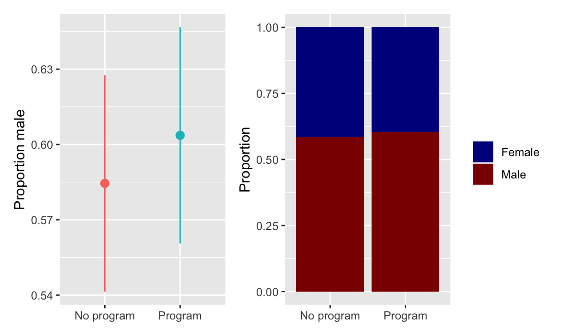
The distribution of ages looks basically the same in the treatment and control groups, and there’s no substantial difference in the average age across groups:
plot_diff_age <- ggplot(village_randomized, aes(x = program, y = age, color = program)) +
  stat_summary(geom = "pointrange", fun.data = "mean_se", fun.args = list(mult = 1.96)) +
  guides(color = FALSE) +
  labs(x = NULL, y = "Age")

plot_hist_age <- ggplot(village_randomized, aes(x = age, fill = program)) +
  geom_histogram(binwidth = 1, color = "white") +
  guides(fill = FALSE) +
  labs(x = "Age", y = "Count") +
  facet_wrap(vars(program), ncol = 1)

plot_diff_age + plot_hist_age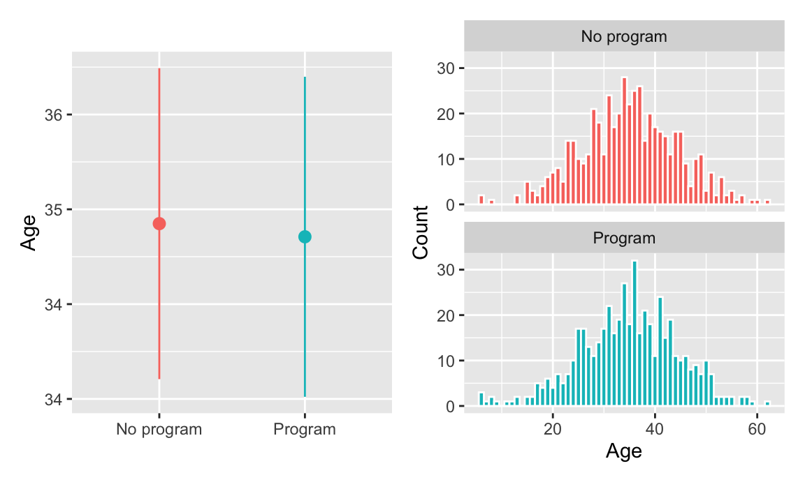
Pre-program income is also distributed the same—and has no substantial difference in averages—across treatment and control groups:
plot_diff_income <- ggplot(village_randomized, aes(x = program, y = pre_income, color = program)) +
  stat_summary(geom = "pointrange", fun.data = "mean_se", fun.args = list(mult = 1.96)) +
  guides(color = FALSE) +
  labs(x = NULL, y = "Pre income")

plot_hist_income <- ggplot(village_randomized, aes(x = pre_income, fill = program)) +
  geom_histogram(binwidth = 20, color = "white") +
  guides(fill = FALSE) +
  labs(x = "Pre income", y = "Count") +
  facet_wrap(vars(program), ncol = 1)

plot_diff_income + plot_hist_income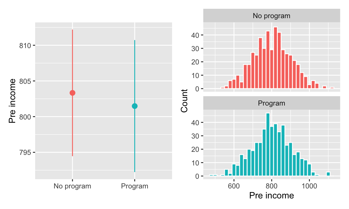
All our pre-treatment covariates look good and balanced! You can now estimate the causal effect of the program.
2. Estimate difference
You can find the causal effect (or average treatment effect) of the program with this formula, based on potential outcomes:
\[ \text{ATE} = E(\overline{\text{Post income }} | \text{ Program} = 1) - E(\overline{\text{Post income }} | \text{ Program} = 0) \]
This is simply the average outcome for people in the program minus the average outcome for people not in the program. You calculate the group averages:
village_randomized %>%
  group_by(program) %>%
  summarize(avg_post = mean(post_income))
## # A tibble: 2 x 2
## program avg_post
## <chr> <dbl>
## 1 No program 1180.
## 2 Program 1279.That’s 1279 − 1180, or 99, which means that the program caused an increase of $99 in incomes, on average.
Finding that difference required some manual math, so as a shortcut, you run a regression model with post-program income as the outcome variable and the program indicator variable as the explanatory variable. The coefficient for program is the causal effect (and it includes information about standard errors and significance). You find the same result:
model_rct <- lm(post_income ~ program, data = village_randomized)
tidy(model_rct)
## # A tibble: 2 x 5
## term estimate std.error statistic p.value
## <chr> <dbl> <dbl> <dbl> <dbl>
## 1 (Intercept) 1180. 4.27 276. 0.
## 2 programProgram 99.2 6.06 16.4 1.23e-53Based on your RCT, you conclude that the program causes an average increase of $99.25 in incomes.
Closing backdoors in observational data
Program details
A consortium of MPA and MPP programs are interested in improving the quantitative skills of their students before they begin their programs. Some schools have developed a two-week math camp that reviews basic algebra, probability theory, and microeconomics as a way to jumpstart students’ quantitative skills for classes like statistics, microeconomics, and program evaluation (👋 y’all!).
These schools have collected data on student outcomes, measuring final degree outcomes with a (totally fake) 120-160 point scale. You’re curious about whether math camps actually have a causal effect on final degree scores.
Unfortunately for you, these schools did not use an RCT to provide access to math camp—students self selected into the program, and all you have is observational data. However, armed with the knowledge of DAGs, confounders, and do-calculus, you think you can still estimate a causal effect!
(For reference, the true causal effect of this (totally fake) program is 10)
Based on your extensive knowledge of MPA/MPP grades and math classes, you draw the following causal model:
math_camp_dag <- dagify(
  final_grade ~ math_camp + gre_quant + gre_verbal +
    undergraduate_gpa + background,
  math_camp ~ needs_camp,
  needs_camp ~ background + undergraduate_gpa + gre_quant,
  gre_quant ~ background + undergraduate_gpa,
  gre_verbal ~ background + undergraduate_gpa,
  undergraduate_gpa ~ background,
  exposure = "math_camp",
  outcome = "final_grade",
  latent = c("background", "needs_camp"),
  coords = list(x = c(math_camp = 2, final_grade = 4, needs_camp = 1, gre_quant = 2.5,
                      gre_verbal = 5, background = 2, undergraduate_gpa = 4),
                y = c(math_camp = 1, final_grade = 1, needs_camp = 2, gre_quant = 2,
                      gre_verbal = 2, background = 3, undergraduate_gpa = 3)),
  labels = c(math_camp = "Math camp", final_grade = "Final grade",
             needs_camp = "Needs camp", gre_quant = "GRE quantitative",
             gre_verbal = "GRE verbal", background = "Background",
             undergraduate_gpa = "Undergraduate GPA")
)

ggdag_status(math_camp_dag, use_labels = "label", text = FALSE, seed = 1234) +
  guides(color = guide_legend(title = NULL)) +
  theme_dag() +
  theme(legend.position = "bottom")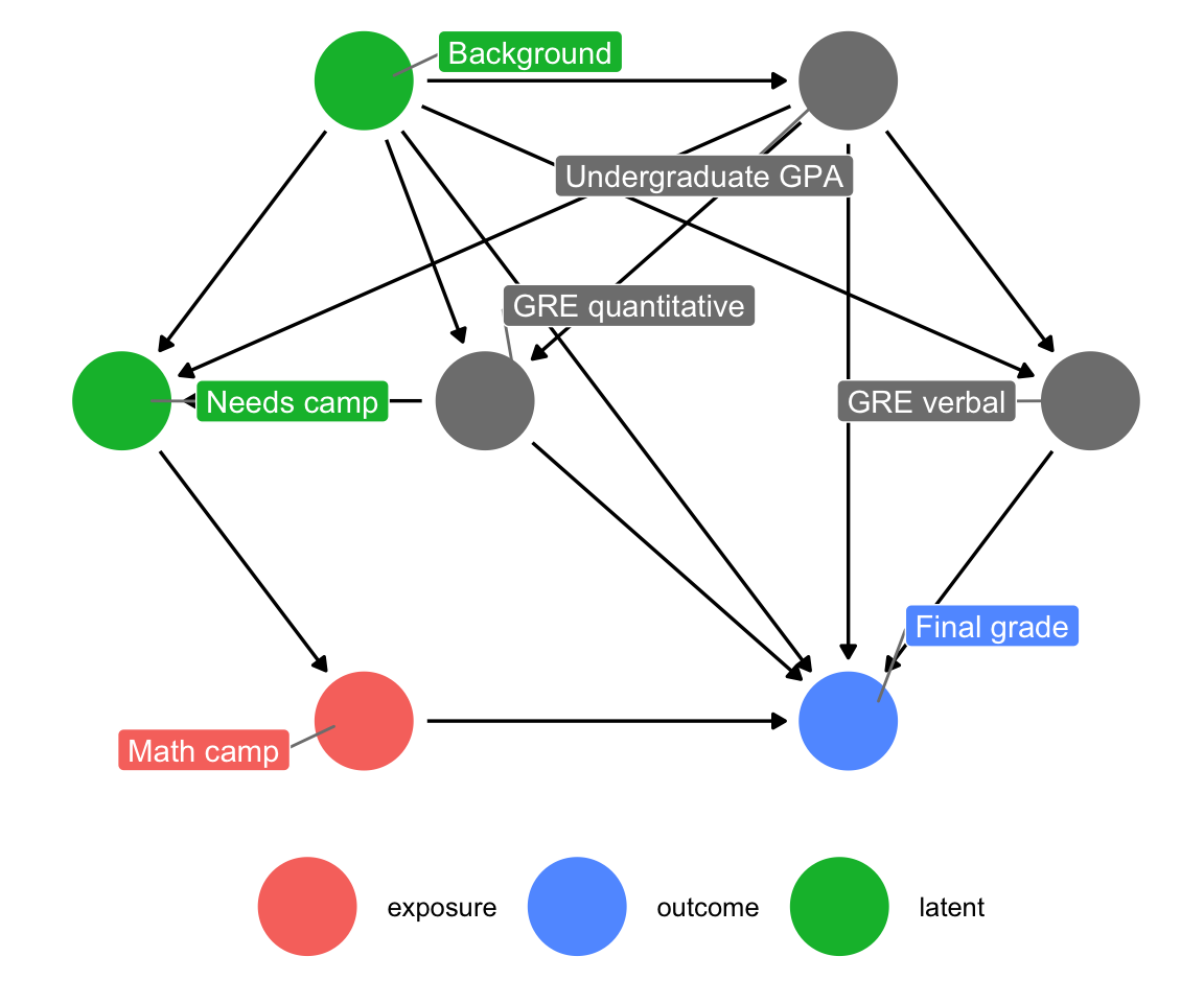
Your final grade in the program is caused by a host of things, including your quantitative and verbal GRE scores (PROBABLY DEFINITELY NOT in real life, but go with it), your undergraduate GPA, and your unmeasured background factors (age, parental income, math anxiety, level of interest in the program, etc.). Your undergraduate GPA is determined by your background, and your GRE scores are determined by both your undergraduate GPA and your background. Because this math camp program is open to anyone, there is self-selection in who chooses to do it. We can pretend that this is decided by your undergraduate GPA, your quantitative GRE score, and your background. If the program was need-based and only offered to people with low GRE scores, we could draw an arrow from GRE quantitative to math camp, but we don’t. Finally, needing the math camp causes people to do it.
There is a direct path between our treatment and outcome (math camp → final grade), but there is also some possible backdoor confounding. Both GRE quantitative and undergraduate GPA have arrows pointing to final grade and math camp (through “needs camp”), which means they’re a common cause, and background is both a confounder and unmeasurable. But you don’t need to give up! If you adjust or control for “needs camp,” you can block the association between background, GRE quantitative, and undergraduate GPA. With this backdoor closed, you’ve isolated the math camp → final grade relationship and can find the causal effect.
However, you don’t really have a measure for needing math camp—we can’t read peoples’ minds and see if they need the program—so while it’d be great to just include a needs_camp variable in a regression model, you’ll have to use other techniques to close the backdoor.
Since you don’t have a variable to indicate needing math camp, you can draw a slightly simpler DAG. Note how the “needs camp” node is an intermediate node on the path between GPA and GRE scores and actually participating in the math camp program. If you can guess what causes people to enroll in the program, that’s roughly the same as predicting their need for the camp. That means you can remove that node (and get rid of background too, just for the sake of extra simplicity; technically it’s still unmeasured too).
math_camp_dag_simpler <- dagify(
  final_grade ~ math_camp + gre_quant + gre_verbal + undergraduate_gpa,
  math_camp ~ undergraduate_gpa + gre_quant,
  gre_quant ~ undergraduate_gpa,
  gre_verbal ~ undergraduate_gpa,
  exposure = "math_camp",
  outcome = "final_grade",
  coords = list(x = c(math_camp = 2, final_grade = 4, gre_quant = 2.5,
                      gre_verbal = 5, undergraduate_gpa = 4),
                y = c(math_camp = 1, final_grade = 1, gre_quant = 2,
                      gre_verbal = 2, undergraduate_gpa = 3)),
  labels = c(math_camp = "Math camp", final_grade = "Final grade", gre_quant = "GRE quantitative",
             gre_verbal = "GRE verbal", undergraduate_gpa = "Undergraduate GPA")
)

ggdag_status(math_camp_dag_simpler, use_labels = "label", text = FALSE, seed = 1234) +
  guides(color = guide_legend(title = NULL)) +
  theme_dag() +
  theme(legend.position = "bottom")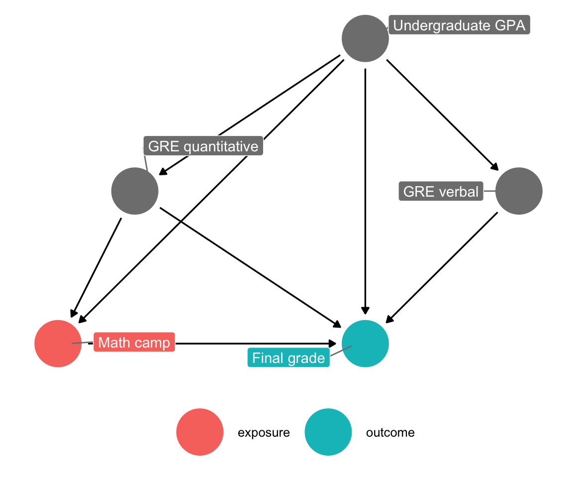
Naive difference in means
For fun, you can calculate the difference in average grades for those who did/didn’t participate in math camp. This is most definitely not the actual causal effect—this is the “correlation is not causation” effect that doesn’t account for any of the backdoors in the DAG.
You can do this with a table (but then you have to do manual math):
math_camp %>%
  group_by(math_camp) %>%
  summarize(number = n(),
            avg = mean(final_grade))
## # A tibble: 2 x 3
## math_camp number avg
## <fct> <int> <dbl>
## 1 No math camp 1182 138.
## 2 Math camp 818 144.Or you can do it with regression:
model_wrong <- lm(final_grade ~ math_camp, data = math_camp)
tidy(model_wrong)
## # A tibble: 2 x 5
## term estimate std.error statistic p.value
## <chr> <dbl> <dbl> <dbl> <dbl>
## 1 (Intercept) 138. 0.185 744. 0.
## 2 math_campMath camp 6.56 0.290 22.6 3.70e-101According to this estimate, participating in math camp is associated with a 6.56 point increase in final grades. We can’t legally talk about casual effects though.
Adjustment using educated-guess-based matching
One big issue with trying to isolate or identify the causal effect between math camp and final grade is that the “needs camp” node is unmeasurable and unobserved (or “latent” in DAG terminology). There’s something that makes people need to participate in math camp, and based on the DAG it’s related to GPA and quantitative GRE scores, but we don’t know what it is exactly. We can attempt to match observations by their need for camp using a kind of manual coarsened exact matching (CEM). If we make an arbitrary decision based on GRE scores or GPA and assume that people below some grade or test score need math camp, that can substitute for the missing “needs camp” node.
You can plot a histogram of GRE scores to see if there’s any possible systematic reason for people to participate in the camp:
ggplot(math_camp, aes(x = gre_quant, fill = math_camp)) +
  geom_histogram(binwidth = 2, color = "white") +
  guides(fill = FALSE) +
  facet_wrap(vars(math_camp), ncol = 1)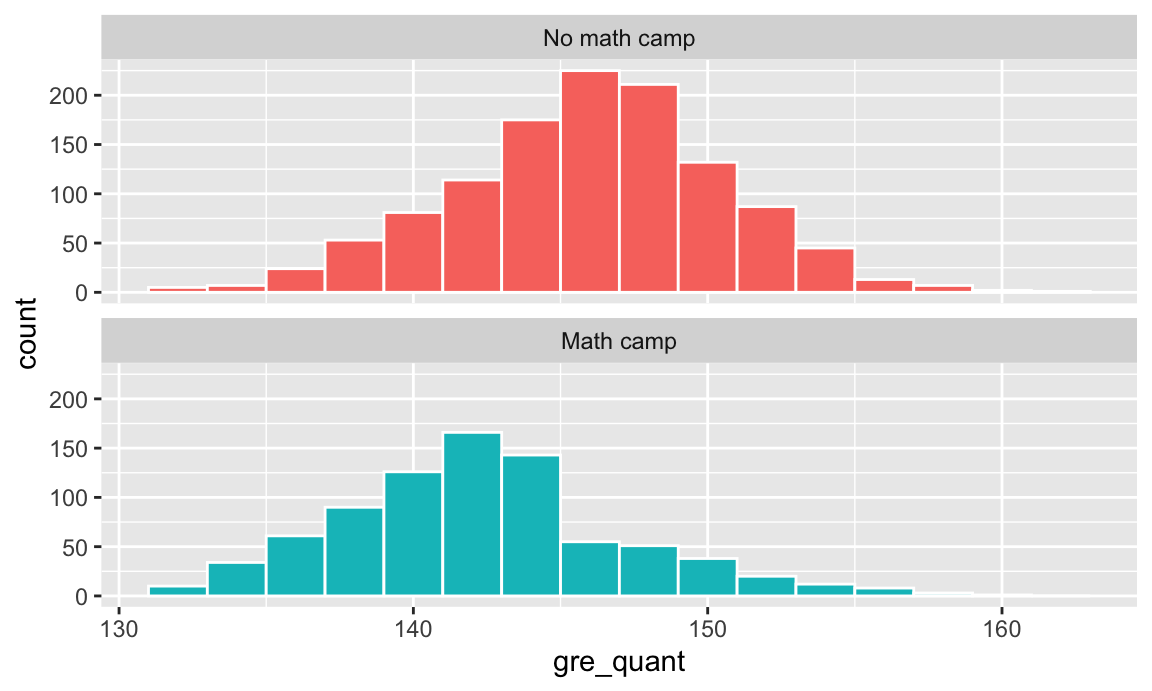
There’s a visible break in the bottom panel. There are a lot more people in math camp who scored under 145 than those who scored above 145. You can guess that people who scored under 145 need the camp and make a new variable indicating that:
math_camp_guessed_need <- math_camp %>%
  mutate(maybe_needs_camp = gre_quant < 145)
We can now adjust for “needs camp” in a regression model, which closes that backdoor and gets us a more accurate estimate of the causal effect:
model_adj_needs_camp_guess <- lm(final_grade ~ math_camp + maybe_needs_camp,
                                 data = math_camp_guessed_need)
tidy(model_adj_needs_camp_guess)
## # A tibble: 3 x 5
## term estimate std.error statistic p.value
## <chr> <dbl> <dbl> <dbl> <dbl>
## 1 (Intercept) 139. 0.193 724. 0.
## 2 math_campMath camp 8.57 0.290 29.6 7.41e-160
## 3 maybe_needs_campTRUE -5.24 0.286 -18.3 1.31e- 69According to this rough estimate of needing math camp, participating in the program causes a 8.57 point increase in final grade.
Adjustment with Mahalanobis nearest-neighbor matching
Instead of trying to figure out the hidden “needs camp” node, we can try modeling participation in math camp directly and essentially get rid of the need for camp. We can use matching techniques to pair up similar observations and make the unconfoundedness assumption—that if we see two observations that are pretty much identical, and one went to math camp and one didn’t, that choice was random.
Because we know from the DAG that undergraduate GPA and quantitative GRE scores help cause participation in math camp, we’ll try to find observations with similar values of GPA and test scores that both went to math camp and didn’t go to math camp.
You can use the matchit() function from the MatchIt R package to match points based on Mahalanobis distance. There are lots of other options available—see the online documentation for details.
You can include the replace = TRUE option to make it so that points that have been matched already can be matched again (that is, we’re not forcing a one-to-one matching; we have one-to-many matching instead).
# For whatever reason, matchit() doesn't work with categorical variables, so we
# have to use math_camp_num instead of math_camp here
matched <- matchit(math_camp_num ~ undergrad_gpa + gre_quant, data = math_camp,
                   method = "nearest", distance = "mahalanobis", replace = TRUE)
summary(matched)
##
## Call:
## matchit(formula = math_camp_num ~ undergrad_gpa + gre_quant,
## data = math_camp, method = "nearest", distance = "mahalanobis",
## replace = TRUE)
##
## Summary of balance for all data:
## Means Treated Means Control SD Control Mean Diff eQQ Med eQQ Mean
## undergrad_gpa 2.8 3.2 0.44 -0.38 0.41 0.38
## gre_quant 142.9 146.5 4.56 -3.61 4.00 3.60
## eQQ Max
## undergrad_gpa 0.45
## gre_quant 5.00
##
##
## Summary of balance for matched data:
## Means Treated Means Control SD Control Mean Diff eQQ Med eQQ Mean
## undergrad_gpa 2.8 2.8 0.47 -0.007 0.22 0.22
## gre_quant 142.9 142.9 4.81 -0.056 2.00 2.29
## eQQ Max
## undergrad_gpa 0.37
## gre_quant 4.00
##
## Percent Balance Improvement:
## Mean Diff. eQQ Med eQQ Mean eQQ Max
## undergrad_gpa 98 47 41 18
## gre_quant 98 50 36 20
##
## Sample sizes:
## Control Treated
## All 1182 818
## Matched 368 818
## Unmatched 814 0
## Discarded 0 0Here you can see that all 818 of the math camp participants were paired with similar-looking non-participants (368 of them). 814 people weren’t matched and will get discarded. If you’re curious, you can see which treated rows got matched to which control rows by running matched$match.matrix.
You can create a new data frame of those matches with match.data():
math_camp_matched <- match.data(matched)Now that the data has been matched, it should work better for modeling. Also, because we used undergraduate GPA and quantitative GRE scores in the matching process, we’ve adjusted for those DAG nodes and have closed those backdoors, so our model can be pretty simple here:
model_matched <- lm(final_grade ~ math_camp, data = math_camp_matched)
tidy(model_matched)
## # A tibble: 2 x 5
## term estimate std.error statistic p.value
## <chr> <dbl> <dbl> <dbl> <dbl>
## 1 (Intercept) 136. 0.343 398. 0.
## 2 math_campMath camp 8.10 0.413 19.6 1.41e-74The 8.1 point increase here is better than the naive estimate, but worse than the educated guess model. Perhaps that’s because the matches aren’t great, or maybe we threw away too much data. There are a host of diagnostics you can look at to see how well things are matched (check the documentation for MatchIt for examples.)
One nice thing about using matchit() is that it also generates a kind of weight based on the distance between points. You can incorporate those weights into the model and get a more accurate estimate:
model_matched_weighted <- lm(final_grade ~ math_camp, data = math_camp_matched, weights = weights)
tidy(model_matched_weighted)
## # A tibble: 2 x 5
## term estimate std.error statistic p.value
## <chr> <dbl> <dbl> <dbl> <dbl>
## 1 (Intercept) 135. 0.336 400. 0.
## 2 math_campMath camp 9.83 0.405 24.3 4.16e-106After using the weights, we find a 9.83 point causal effect. That’s much better than any of the other estimates we’ve tried.
Adjustment with inverse probability weighting
One potential downside to matching is that you generally have to throw away a sizable chunk of your data—anything that’s unmatched doesn’t get included in the final matched data.
An alternative approach to matching is to assign every observation some probability of receiving treatment, and then weighting each observation by its inverse probability—observations that are predicted to get treatment and then don’t, or observations that are predicted to not get treatment and then do will receive more weight than the observations that get/don’t get treatment as predicted.
Generating these inverse probability weights requires a two step process: (1) you first generate propensity scores, or the probability of receiving treatment, and then (2) you use a special formula to convert those propensity scores into weights. Once you have weights, you can incorporate them into your regression model like we did above with the matched and weighted data.
Oversimplified crash course in logistic regression
There are many ways to generate propensity scores (like logistic regression, probit regression, and even machine learning techniques like random forests and neural networks), but logistic regression is probably the most common method.
The complete technical details of logistic regression are beyond the scope of this class, but if you’re curious you should check out this highly accessible tutorial.
All you really need to know is that the outcome variable in logistic regression models must be binary, and the explanatory variables you include in the model help explain the variation in the likelihood of your binary outcome. The Y (or outcome) in logistic regression is a logged ratio, which forces the model’s output to be in a 0-1 range:
\[ \log \frac{p_y}{p_{1-y}} = \beta_0 + \beta_1 x_1 + \beta_2 x_2 + \dots + \beta_n x_n + \epsilon \]
Here’s what it looks like visually. Because math camp attendance is a binary outcome, there are lines of observations at 0 and 1 along the y axis. The blue S-curved line here shows the output of a logistic regression model—people with low test scores have a high likelihood of attending math camp, while those with high scores are far less likely to do so.
I also included a red line showing the results from a regular old lm() OLS model. It follows the blue line fairly well for a while, but predicts negative probabilities for high test scores. For strange historical and mathy reasons, many economists like using OLS on binary outcomes (they even have a fancy name for it: linear probability models (LPMs)), but I’m partial to logistic regression since it doesn’t generate probabilities greater than 100% or less than 0%. (BUT DON’T EVER COMPLAIN ABOUT LPMs ONLINE. You’ll start battles between economists and other social scientists. 🤣)
ggplot(math_camp, aes(x = gre_quant, y = math_camp_num)) +
  geom_point(alpha = 0.1) +
  geom_smooth(method = "lm", color = "red", size = 0.5) +
  geom_smooth(method = "glm", method.args = list(family = binomial(link = "logit"))) +
  labs(x = "Quantitative GRE score", y = "Probability of attending math camp")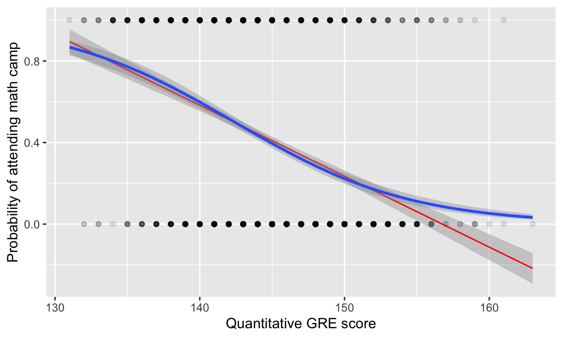
The coefficients from a logistic regression model are interpreted differently than you’re used to (and their interpretations can be controversial!). Here’s an example for the model in the graph above:
# Notice how we use glm() instead of lm(). The "g" stands for "generalized"
# linear model. We have to specify a family in any glm() model. You can
# technically run a regular OLS model (like you do with lm()) if you use
# glm(y ~ x1 + x2, family = gaussian(link = "identity")), but people rarely do that.
#
# To use logistic regression, you have to specify a binomial/logit family like so:
# family = binomial(link = "logit")
model_logit <- glm(math_camp ~ gre_quant, data = math_camp,
                   family = binomial(link = "logit"))

tidy(model_logit)
## # A tibble: 2 x 5
## term estimate std.error statistic p.value
## <chr> <dbl> <dbl> <dbl> <dbl>
## 1 (Intercept) 23.4 1.59 14.7 5.27e-49
## 2 gre_quant -0.165 0.0110 -14.9 2.34e-50The coefficients here aren’t normal numbers—they’re called “log odds” and represent the change in the logged odds as you move explanatory variables up. For instance, here the logged odds of attending math camp decrease by 0.16 for every one point increase in your GRE quantitative score. But what do logged odds even mean?! Nobody knows.
You can make these coefficients slightly more interpretable by unlogging them and creating something called an “odds ratio.” These coefficients were logged with a natural log, so you unlog them by raising \(e\) to the power of the coefficient. The odds ratio for the GRE quantitative score is \(e^-0.165\), or 0.85. Odds ratios get interpreted a little differently than regular model coefficients. Odds ratios are all centered around 1—values above 1 mean that there’s an increase in the likelihood of the outcome, while values below 1 mean that there’s a decrease in the likelihood of the outcome. Our GRE coefficient here is 0.85, which is 0.15 below 1, which means we can say that for every one point increase in someone’s quantitative GRE score, they are 15% less likely to attend math camp. If the coefficient was something like 1.34, we could say that they’d be 34% more likely to attend; if it was something like 5.02 we could say that they’d be 5 times more likely to attend; if it was something like 0.1, we could say that they’re 90% less likely to attend.
You can make R exponentiate the coefficients automatically by including exponentiate = TRUE in tidy():
tidy(model_logit, exponentiate = TRUE)## # A tibble: 2 x 5
## term estimate std.error statistic p.value
## <chr> <dbl> <dbl> <dbl> <dbl>
## 1 (Intercept) 1.51e+10 1.59 14.7 5.27e-49
## 2 gre_quant 8.48e- 1 0.0110 -14.9 2.34e-50BUT AGAIN this goes beyond the scope of this class! Just know that when you build a logistic regression model, you’re using explanatory variables to predict the probability of an outcome.
Creating and using inverse probability weights
Phew. With that little tangent, you can build a model to generate propensity scores (or predicted probabilities), and then adjust those propensity scores to create weights. When you include variables in the model that generates the propensity scores, you’re closing backdoors in the DAG. And unlike matching, you’re not throwing any data away—you’re just making some points more important and other less important.
First we build a model that predicts math camp attendance based on undergraduate GPA and quantitative GRE scores (since those nodes cause math camp in our DAG):
needs_camp_model <- glm(math_camp ~ undergrad_gpa + gre_quant, data = math_camp,
                        family = binomial(link = "logit"))

# We could look at these results if we wanted, but we don't need to for this class
# tidy(needs_camp_model, exponentiate = TRUE)
We can then plug in the GPA and test score values for every row in our dataset and generate a predicted probability:
# augment_columns() handles the plugging in of values. You need to feed it the
# name of the model and the name of the dataset you want to add the predictions
# to. The type.predict = "response" argument makes it so the predictions are in
# the 0-1 scale. If you don't include that, you'll get predictions in an
# uninterpretable log odds scale.
math_camp_propensities <- augment_columns(needs_camp_model, math_camp,
                                          type.predict = "response") %>%
  rename(p_camp = .fitted)

# Look at the first few rows of a few columns
math_camp_propensities %>%
  select(id, math_camp, undergrad_gpa, gre_quant, p_camp) %>%
  head()
## # A tibble: 6 x 5
## id math_camp undergrad_gpa gre_quant p_camp
## <dbl> <fct> <dbl> <dbl> <dbl>
## 1 1 No math camp 3.9 151 0.0996
## 2 2 No math camp 3.2 143 0.373
## 3 3 Math camp 2.83 140 0.563
## 4 4 No math camp 2.63 154 0.301
## 5 5 No math camp 3.24 148 0.258
## 6 6 No math camp 2.95 146 0.381The propensity scores are in the p_camp column. Some people, like person 1, are unlikely to have attended camp (only a 10% chance) since they have high grades and test scores. Others like person 3 have a higher probability (56%) since their grades and test scores are lower. Neat.
Next you need to convert those propensity scores into inverse probability weights, which makes weird observations more important (i.e. people who had a high probability of attending camp but didn’t, and vice versa). To do this, you follow this equation:
\[ \frac{\text{Treatment}}{\text{Propensity}} - \frac{1 - \text{Treatment}}{1 - \text{Propensity}} \]
This equation will create weights that provide the average treatment effect (ATE), but there are other versions that let you find the average treatment effect on the treated (ATT), average treatment effect on the controls (ATC), and a bunch of others. You can find those equations here.
Next, create a column for the inverse probability weight:
math_camp_ipw <- math_camp_propensities %>%
  mutate(ipw = (math_camp_num / p_camp) + ((1 - math_camp_num) / (1 - p_camp)))

# Look at the first few rows of a few columns
math_camp_ipw %>%
  select(id, math_camp, undergrad_gpa, gre_quant, p_camp, ipw) %>%
  head()
## # A tibble: 6 x 6
## id math_camp undergrad_gpa gre_quant p_camp ipw
## <dbl> <fct> <dbl> <dbl> <dbl> <dbl>
## 1 1 No math camp 3.9 151 0.0996 1.11
## 2 2 No math camp 3.2 143 0.373 1.60
## 3 3 Math camp 2.83 140 0.563 1.78
## 4 4 No math camp 2.63 154 0.301 1.43
## 5 5 No math camp 3.24 148 0.258 1.35
## 6 6 No math camp 2.95 146 0.381 1.62These first few rows all have fairly low weights—those with low probabilities of attending math camp didn’t, while those with high probabilities did. But there are other people in the data with high weights (look at person 558 for example: they have a 4.0 and scored really high on the GRE, and yet they inexplicably went to math camp, so their IPW score is 28)
Finally, we can run a model to find the effect of math camp on final grades. Again, we don’t need to include GPA or GRE scores in the model since we already used them when we created the propensity scores and weights:
model_ipw <- lm(final_grade ~ math_camp,
                data = math_camp_ipw, weights = ipw)
tidy(model_ipw)
## # A tibble: 2 x 5
## term estimate std.error statistic p.value
## <chr> <dbl> <dbl> <dbl> <dbl>
## 1 (Intercept) 137. 0.223 613. 0.
## 2 math_campMath camp 10.9 0.308 35.3 8.50e-213Cool! After using the inverse probability weights, we find a 10.88 point causal effect. That’s a little higher than the true values of 10, but not bad.
It might be too high because some of the weights are pretty big. People like person 558—students with absolutely perfect grades and test scores who still go to math camp—could be skewing the results. Excessively large weights could be making these people too important. To fix this, we can truncate weights at some lower level. There’s no universal rule of thumb for a good maximum weight—I’ve often seen 10 used, so we’ll try that. Add a new column that makes the weight 10 if it’s greater than 10:
math_camp_ipw <- math_camp_ipw %>%
  mutate(ipw_truncated = ifelse(ipw > 10, 10, ipw))

model_ipw_truncated <- lm(final_grade ~ math_camp,
                          data = math_camp_ipw, weights = ipw_truncated)
tidy(model_ipw_truncated)
## # A tibble: 2 x 5
## term estimate std.error statistic p.value
## <chr> <dbl> <dbl> <dbl> <dbl>
## 1 (Intercept) 137. 0.219 622. 0.
## 2 math_campMath camp 10.6 0.306 34.7 4.30e-207Now the causal effect is 10.61, which is slightly lower and probably more accurate since we’re not letting exceptional cases blow up our estimate.
Comparison of all results
Let’s compare all the ATEs that we just calculated:
| Method | ATE |
|---|---|
| True causal effect | 10 |
| Naive (wrong!) difference in means | 6.558 |
| Educated-guess-based matching | 8.571 |
| Mahalanobis nearest-neighbor matching (unweighted) | 8.104 |
| Mahalanobis nearest-neighbor matching (weighted) | 9.834 |
| Inverse probability weights | 10.88 |
| Inverse probability weights (truncated) | 10.61 |
Clearest and muddiest things
Go to this form and answer these three questions:
- What was the muddiest thing from class today? What are you still wondering about?
- What was the clearest thing from class today?
- What was the most exciting thing you learned?
I’ll compile the questions and send out answers after class.